Although technology is an attractive add to a stale classroom, stuffing schools with high tech tools isn’t the answer to offering dynamic learning experiences. Technology is certainly a part of that solution, but the rest of the environment has to also be considered and curated. To expect any standalone product to change the dynamic of a classroom feels unrealistic.
We’ve found that infusions of tech work best when they’re considered as part of the entire learning environment, including the space and conditions that enable technology to be functional and effective.
As architects for learning spaces, we help schools and education providers who want to shift their students’ learning experience to one that is more collaborative, hands-on, project based, and relevant to their lives. These pioneering educators want learning that is full of variety. When it comes to the physical space, we agree that diversity is key.
Picture a place where students can read alone, collaborate in small groups, or present to a large audience; where students can chose their favorite medium for learning or working; and where everything around them is inspiring students to constantly voice their ideas and think big. High tech gadgets play a big role in this, but so does the “low tech” — a space’s layout, equipment, graphics and messaging, and overall vibe.
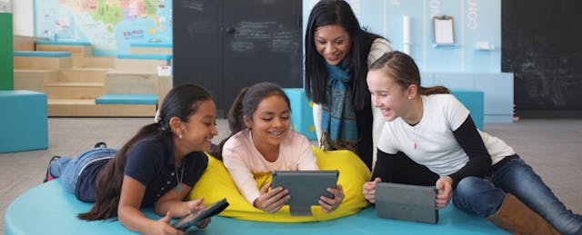
Recently, we conducted an experiment with the Denver Public Schools Imaginarium to redesign one room at Columbine Elementary. Our challenge was to revamp a classroom that was originally built in 1947 to support today’s teachers and students in personalizing their learning. The first thing we did was facilitate workshops where teachers dreamt up a space that encouraged “collaboration” and “idea sharing” and would be “easy to reconfigure” for all grade levels. Students wanted to name it the “Dialogue District.”
Our process took us through Summer 2015, with five weeks of workshops and design followed by eight weeks of construction. With creativity and the help of local fabricators, we were able to transform the old room for $75 a square foot (far less than average school construction costs which range from $150-$500 per square foot). This included a gut renovation of the room. We changed the lighting, plumbing and flooring, and added custom furniture and new tech like a Promethean touchscreen, audio speakers, and a camera mount for recording classes.

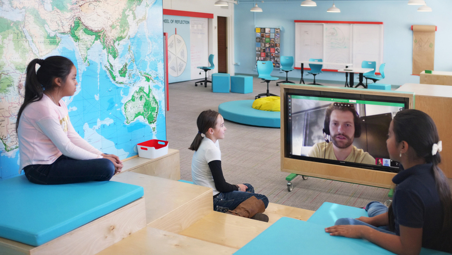
One of the most popular features of the new classroom is the Skype Mountain. Students can sit, congregate, and connect with the world from this mountain. Teachers can use the amphitheater-style setup to facilitate conversations between students and guest speakers. The tech is there — a rolling TV panel with a mirroring device (like a Chromebit) — but it’s the unexpected and fun terrain that invites kids to come watch TED talks and share from their personal devices onto the big screen.
In the spirit of experimentation and prototyping we also developed a new low-tech learning tool called the “Drafting Cake.” It’s a multi-layered whiteboard, but instead of opaque white, the layers are clear so students can learn about overlaying and systems in a visual, tactile way. The Drafting Cake functions like Adobe Photoshop or Illustrator. It gives kids a medium for diagramming the different layers of a larger system (the muscles, organs, and nerves of the human body or the streets, buildings, and green spaces of a city).
The rolling panels also allow for compare and contrast. Let’s say three students are asked to accurately draw the Passion flower. Once they’re done drawing, slide the clear panels on top of one another to compare. For teachers, this is a great moment to highlight and explain the flower’s unique pattern of sepals and petals.
The Drafting Cake makes these lessons kinesthetic and helps teachers guide students through new concepts.
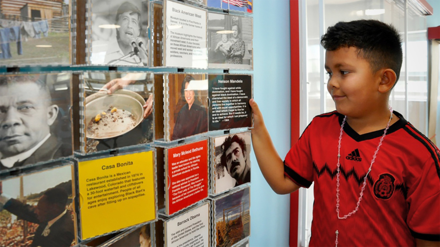
Another newly designed feature of the room is the Storyboard, which houses a gallery of inspiring figures, historical events, and landmarks. Teachers can curate this visual tool with inspiring content that ties back to the lessons they are teaching. Updating the inspirations is as easy as swapping out the 6”x6” printed graphics in the revolving frames.
For the Storyboard we decided to locate simpler content near the bottom, for younger kids, and increase its complexity towards the top, where the older students could see.
With so many things asked of students these days, and so many steps to they have to go through to complete assignments, sometimes it’s nice to wander around the room and stumble upon a neat story about Mayor Michael Hancock or the Colorado gold rush.

In the design workshops, teachers also expressed a need to teach students how to give constructive feedback. They felt it was critical skill embedded in collaborating and idea sharing. To help with this, we built the Contemplation Station, a game that scaffolds this skill set.
Just before a student takes the stage to present her work, six of her peers are asked to sit as a jury for the presentation. Each jury member must first roll a giant dice. Based on the number rolled, students pick up a clipboard which has a prompt for them. When it’s time to offer feedback, the students can turn to their prompt for a meaningful question, such as “Something I would want to learn more about is _____.” As with all scaffolds, the hope is that after some time students will naturally begin to ask the type of questions learned from this game and offer each other better feedback.

With the big push towards personalized learning, adaptive curriculum, and real-world challenges in the classroom has come a wave of new technologies for learners. These devices and platforms certainly help, but shouldn’t be our entire response.
New learning needs new environments. With the help of Denver Public Schools, we’re asking what it takes to build a 21st century place of learning and how to augment the fresh technologies arriving in our schools. Experiments like the one at Columbine are helping us answer that more and more by the day.


